UI designer
Space Traveler
A cyan holographic UI for exploring planets, meeting inhabitants and gathering material for a novel.
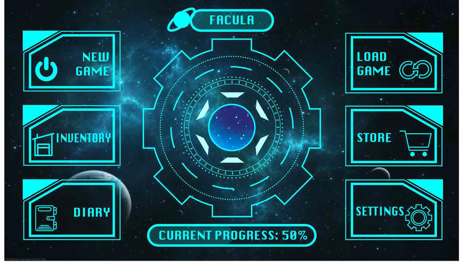
Space Traveler is a PC adventure concept about gathering stories across planets. I designed a cyan holographic interface with stable navigation, crisp outlines and beveled panels that keep the game world visible.
- Role
- UI designer
- Project
- PC adventure concept
- Focus
- Navigation & inventory
- Style
- Cyan holographic
01 / NAVIGATION
The main menu and landing page support different decisions
The main menu places six labeled functions around the current planet and shows overall progress below it. The separate planet-details screen places exploration and mission progress beside LAND. I kept the planet at the center of both compositions while giving each screen the information needed for its next action.
02 / HUD & MISSION FLOW
Leave room for the encounter
TALK stays beside the NPC, while missions and shortcuts sit at the edges. The mission flow supports accepting, declining and giving up a task, with both success and failure returning to play.
03 / INVENTORY
The wireframe and final inventory keep the same two regions
Category tabs sit above the item grid on the right. The left detail panel keeps the selected object’s illustration, name and description visible. The wireframe and final UI preserve these regions; color and beveled edges add visual hierarchy without moving the browsing structure.
04 / DIALOGUE
The guardian’s request points toward a permission item
The guardian asks for permission to enter. Players can show the item or decide to look for it. The same Factory Permission label appears in the inventory, giving the dialogue request a clear object to find.
05 / UI KIT
Bright outlines mark actions; dark panels hold information
The UI kit uses bright cyan outlines for buttons and recognizable icons for navigation. Shared beveled corners connect LAND, the back button and information panels. Dark fills separate text areas from the scene while the cyan edges keep panel boundaries visible.